Endless calculations to the people
Well maybe not endless, but at least very, very, very, very many!
Let me clarify slightly.
Or if you prefer to just see what I created and test it yourself, click here!
In Power BI, one of the biggest upsides is the ability for the user to interact with the data and find their own interesting insights. I want to show you a way to take this to the next level! What if you, the user, could create calculations inside of Power BI on the fly?
We’ll begin with this set of totally not made up data.
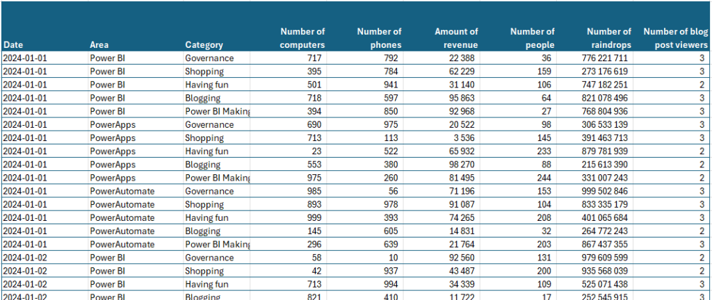
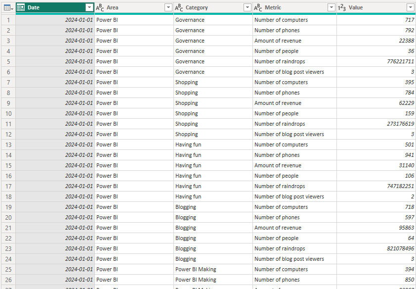
When importing the data, I’ve unpivoted the table on Date, Area and Category so that all the value columns became record attributes. This turned my roughly 5 000+ rows into almost 33 000 rows. Worth it!
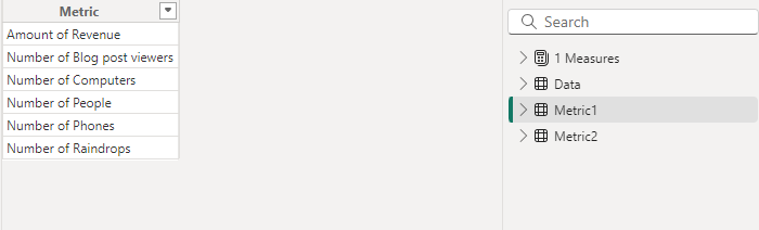
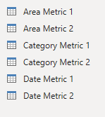
I then manually created 2 tables with my Metric-names in them. They’re identical and look like this.
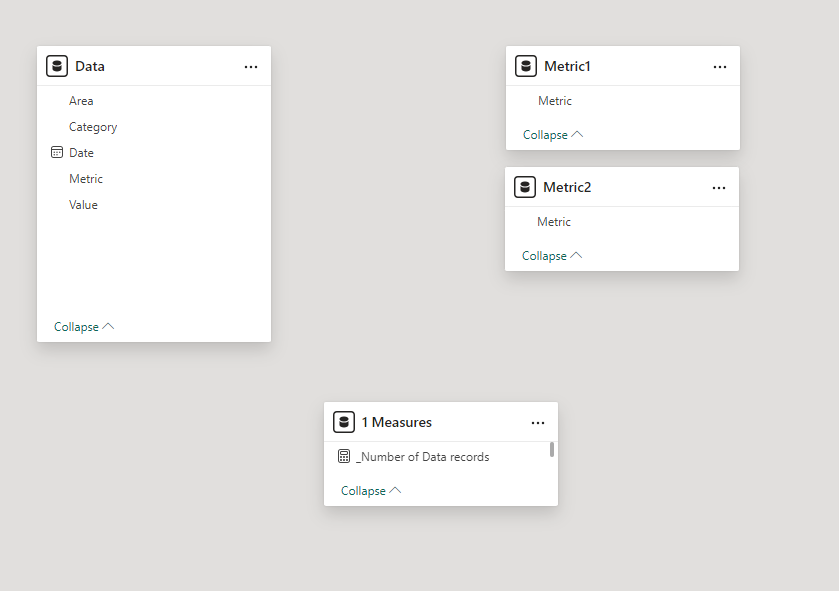
Make sure there’s no relationships between any of the tables at this point.
Now I’ve added a slicer from each Metric-table to the canvas and made them Single Select!
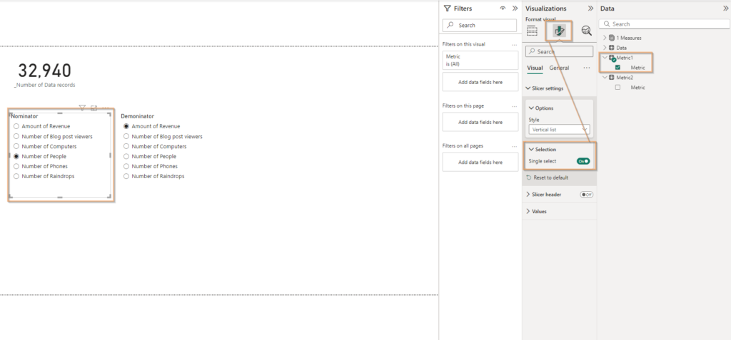
To get the value from my first Metric, the Numerator (I named it wrong in the print screen for extra confusion) you can create this measure!
_Value from Metric 1 =
VAR Value1 = SELECTEDVALUE(Metric1[Metric],0)

Return

CALCULATE(
    SUM(Data[Value]),
    FILTER(
        Data,
        Data[Metric] = Value1
    )
)
And to get the second metric we would use this:
_Value from Metric 2 =
VAR Value2 = SELECTEDVALUE(Metric2[Metric],0)
Return
CALCULATE(
SUM(Data[Value]),
FILTER(
Data,
Data[Metric] = Value2
)
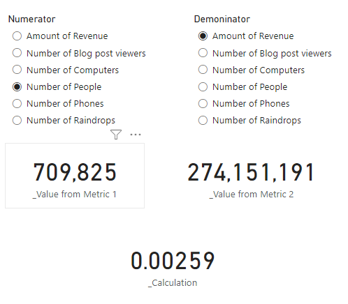
)Neat! Now I’ve placed to cards on the canvas just to show that we can generate the summed up outcome by selecting each metric in the slicers.
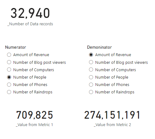
So far so good! We can now make calculations based on these to values. Let’s try dividing them.
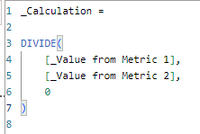
My new calculation can now divide any number from the left side with any number from the right side! Great! This gives us like 31 different outcomes (6 will render 1 when dividing the same value).
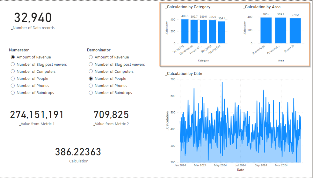
But hey, let’s not forget. We hade dates, categories and areas!
I happened to have the whole year of 2024 in my data, meaning that this graph shows another 366 possible values depending on what day we look at!
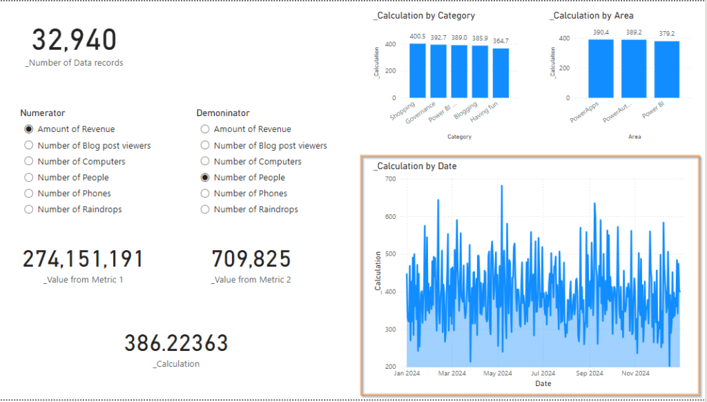
And for each of these days I can select one or more category and/or area to further filter the data.
At this point, I’m sure you’re thinking: “Ough.. I wanted so much more! Aren’t we going to create like a million more possible values out of this?”
The answer is Yes!
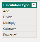
Let’s create a table for calculation types, like so:
Again adding the slicer to the page and make it single select
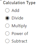
Now let’s adjust the calculation measure with a switch like this:
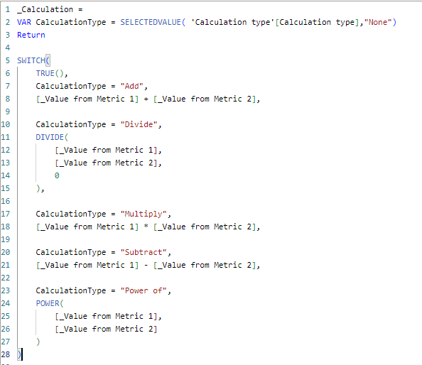
_Calculation =
VAR CalculationType = SELECTEDVALUE( 'Calculation type'[Calculation type],"None")
Return

SWITCH(
    TRUE(),
    CalculationType = "Add",
    [_Value from Metric 1] + [_Value from Metric 2],

    CalculationType = "Divide",
    DIVIDE(
        [_Value from Metric 1],
        [_Value from Metric 2],
        0
    ),

    CalculationType = "Multiply",
    [_Value from Metric 1] * [_Value from Metric 2],

    CalculationType = "Subtract",
    [_Value from Metric 1] - [_Value from Metric 2],

    CalculationType = "Power of",
    POWER(
        [_Value from Metric 1],
        [_Value from Metric 2]
    )
)
The Power of calculation is probably a bit overkill as we have quite high values here.
Anyhow – are we done yet? Is there no more power to provide our users?
Of course there is! Let’s take it one more unnecessary step further, shall we!
I’m heading back into Power Query to create not one, but 2 dimensional tables. Per dimension. One for each metric you see.
This time I do set up relationships with the Data table, like this:
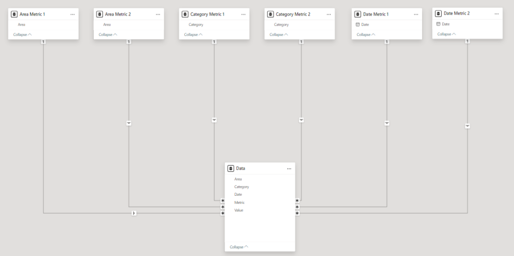
This does however require us to use Crossfilter in our measures so that metric 1 is not effected by the filters for measure 2 and vice versa. I’m going to fix that in just a sec, but first, let’s take things even further!
I created this aggregation Type table
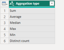
I broke out the aggregation into a separate measure like this, so that when you select an aggregation above it will determine how to calculate the metric. (Yes, there are 2. One for each metric!)
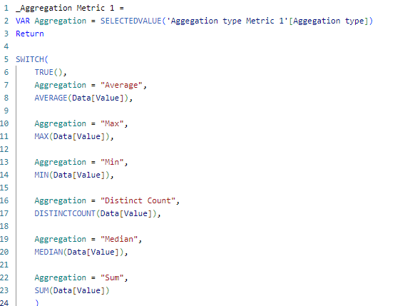
_Aggregation Metric 1 =
VAR Aggregation = SELECTEDVALUE('Aggegation type Metric 1'[Aggegation type])
Return

SWITCH(
    TRUE(),
    Aggregation = "Average",
    AVERAGE(Data[Value]),

    Aggregation = "Max",
    MAX(Data[Value]),

    Aggregation = "Min",
    MIN(Data[Value]),

    Aggregation = "Distinct Count",
    DISTINCTCOUNT(Data[Value]),

    Aggregation = "Median",
    MEDIAN(Data[Value]),

    Aggregation = "Sum",
    SUM(Data[Value])
    )
After that, I call the measure in the Value for Metric 1-measure like this:
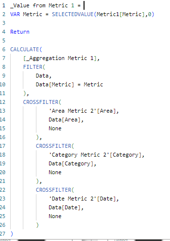
_Value from Metric 1 =
VAR Metric = SELECTEDVALUE(Metric1[Metric],0)

Return

CALCULATE(
    [_Aggregation Metric 1],
    FILTER(
        Data,
        Data[Metric] = Metric
    ),
    CROSSFILTER(
            'Area Metric 2'[Area],
            Data[Area],
            None
        ),
        CROSSFILTER(
            'Category Metric 2'[Category],
            Data[Category],
            None
        ),
        CROSSFILTER(
            'Date Metric 2'[Date],
            Data[Date],
            None
        )
)
I now finally took some time to give the report UI some love. Now we’re really starting to get somewhere, huh?
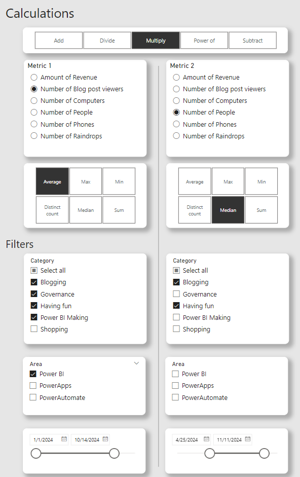
I finally added the actual values on the right side like this
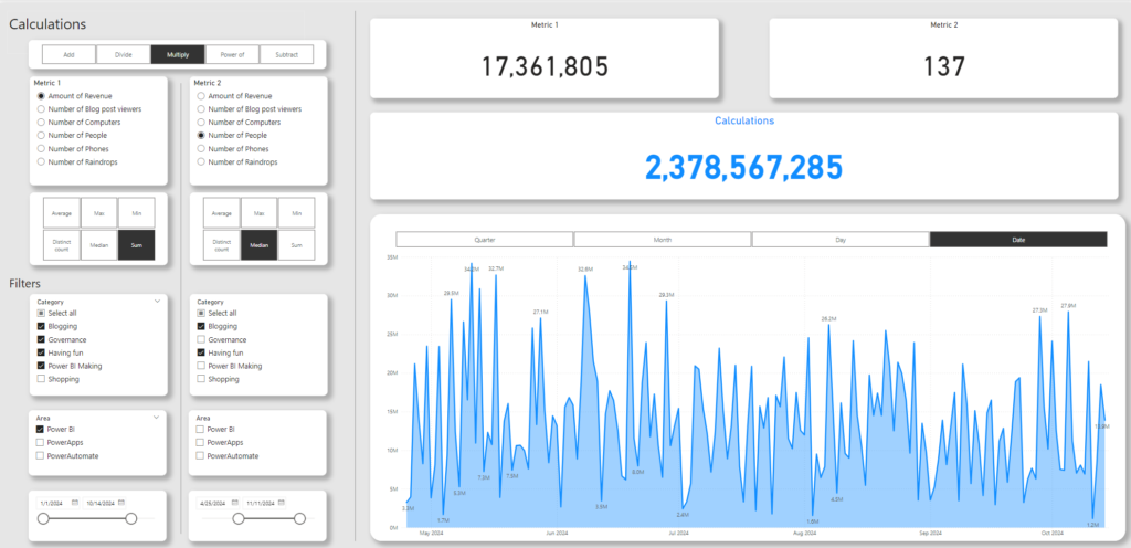
Now you can really select all kinds of metrics, aggregations and filtering and see the result of your making on the right!
Now imagine making all of these possible calculations manually.